Veronica Manglirawan
Veronica Manglirawan
Veronica Manglirawan is an experienced goal digger and marketing mixologist. Extremely detailoriented with a sprinkle of OCD, she takes pride in her stellar work ethic with the capacity of being as scrappy as possible to find the perfect solution that gets the job done. With a background in hospitality, retail, customer service, and marketing, Veronica has been professionally recognized in the sales & marketing industry for her drive to succeed and personable traits.
If she’s not in front of her computer creating cool stuff, she loves to be at the beach or traveling to exotic locations around the world, at least, when not hindered by a global pandemic. Hailing from her native Long Island, New York, there’s nothing that can’t be achieved – Fuhgeddaboudit!
Nibble on Some of Our Favs
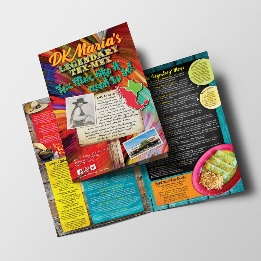
DK Maria’s
This was a fun project because the owner was extremely passionate about the history of the family-owned business. It was exciting to bring the legacy to life though the color and spice of the menu. The first print was great, but we evolved the next print with more color, flair and made it truly legendary, like DK Maria herself! When an operator truly believes in the concept of their business, it’s very inspiring for me to give them the best possible menu that matches their vision.
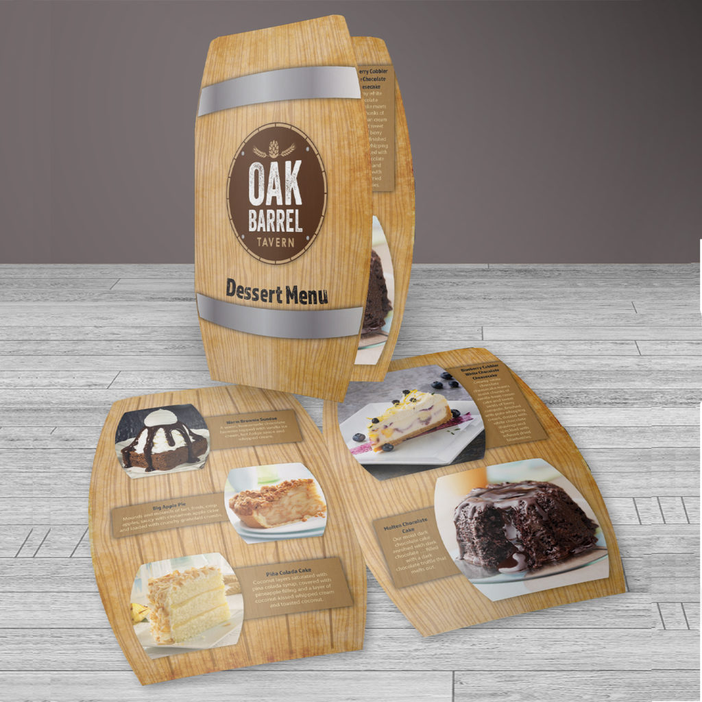
The Keg Room
This is one of my favorite projects because it was the first true Out-Of-The-Box menu I had done for our customer, Sweet Street Desserts. They were looking for an agency that went beyond the basic programmed templates. Their customer, The Keg Room, located in New York City, needed a dessert menu. A native of Long Island, I really wanted to take this to the next level. I thought, “what if we did a menu in the shape of a keg?” It was a success. Later, after seeing what we had done, Sweet Street hired us to create menu marketing, and the Sweet Street Design Suite was born.
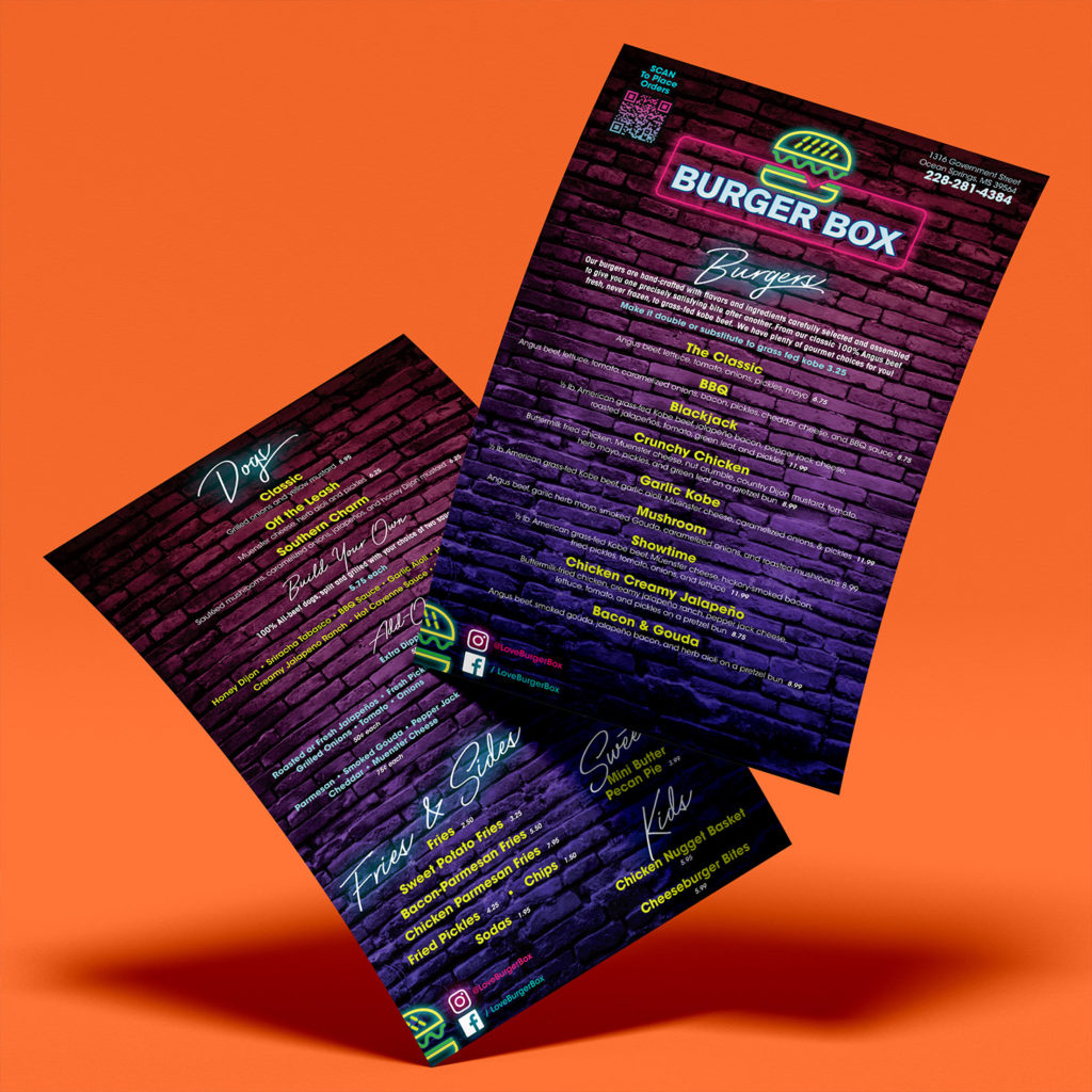
Burger Box
I met a Ben E Keith sales rep at a food show and he expressed the need for a menu for a new concept his customer was working on. It was a late-night burger joint, located on a lively block intended for the late night crowd. Somehow, I came up with a neon lights theme, as if you stepped out of a nightclub onto a back alley, with the glow of neon signs reflecting off the brick building. It inspired me to work on my adobe technique and become a stronger designer. I love how it turned out and feel it also reflects who I am as a person – cool, colorful, and shines bright!
